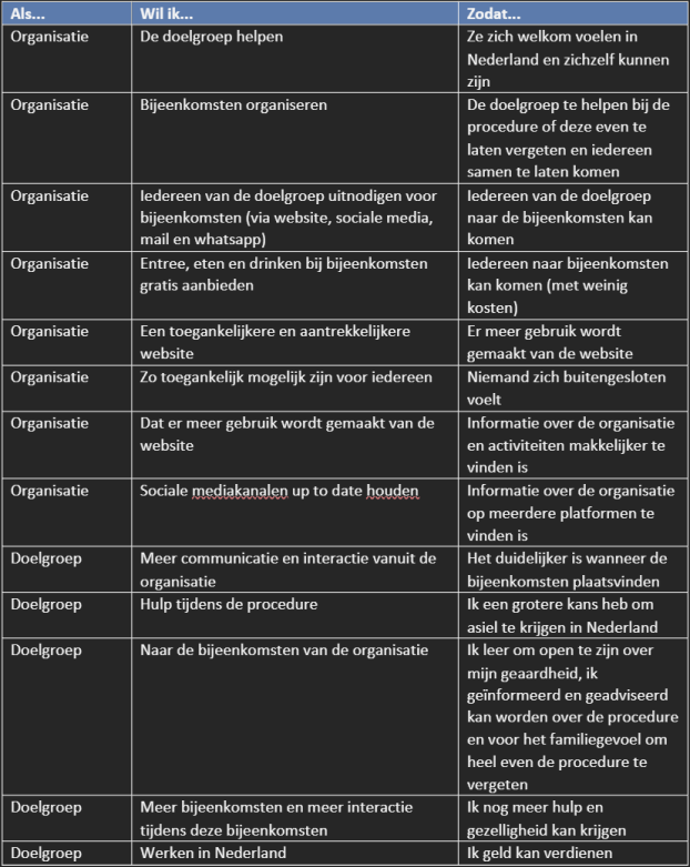
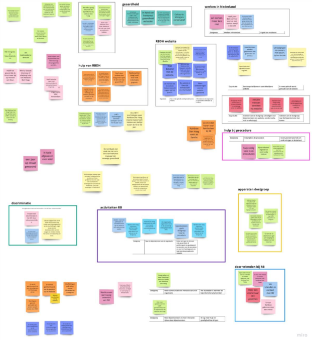
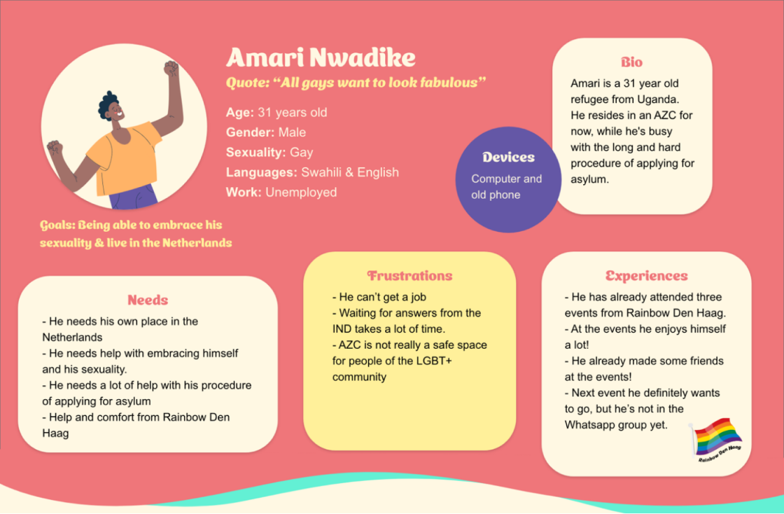
Rainbow Den Haag website improvement
Designing a mobile app to help families create a fair distribution of household tasks. Integrating gamification and a reward system to motivate children, track progress, and provide structure for families.
Timeline
Aug - Okt 2022
My role
UX / UI designer
Tools
Miro, Canva, Adobe XD
Problem
Parents struggle to keep track of household tasks, leading to unclear expectations and unfinished chores. Traditional planning methods no longer fit children’s digital habits and parents are unsure how to keep their children engaged in doing household tasks.
Solution
An app which provides families a clear task overview supported by gamification and a rewards system to motivate children in a way to fit their digital habits.
View final design
Design process
1
Empathize
User interviews
Surveys
2
define
User needs
Synthesis wall
3
ideate
Mindmapping
Lotus technique
Moodboards
4
conceptualise
Sketches
Wireframes
5
Prototype
Hi-fi prototype
Persona based walkthrough
Empathize
User interviews
In order to understand what the users needed for the Rainbow Den Haag website to be improved we conducted user interviews. We were able to reach the users by attending one of the hangouts hosted by Rainbow Den Haag. The interviews helped us answer the main research questions and we gained an understanding of their needs. These are the main takeaways:

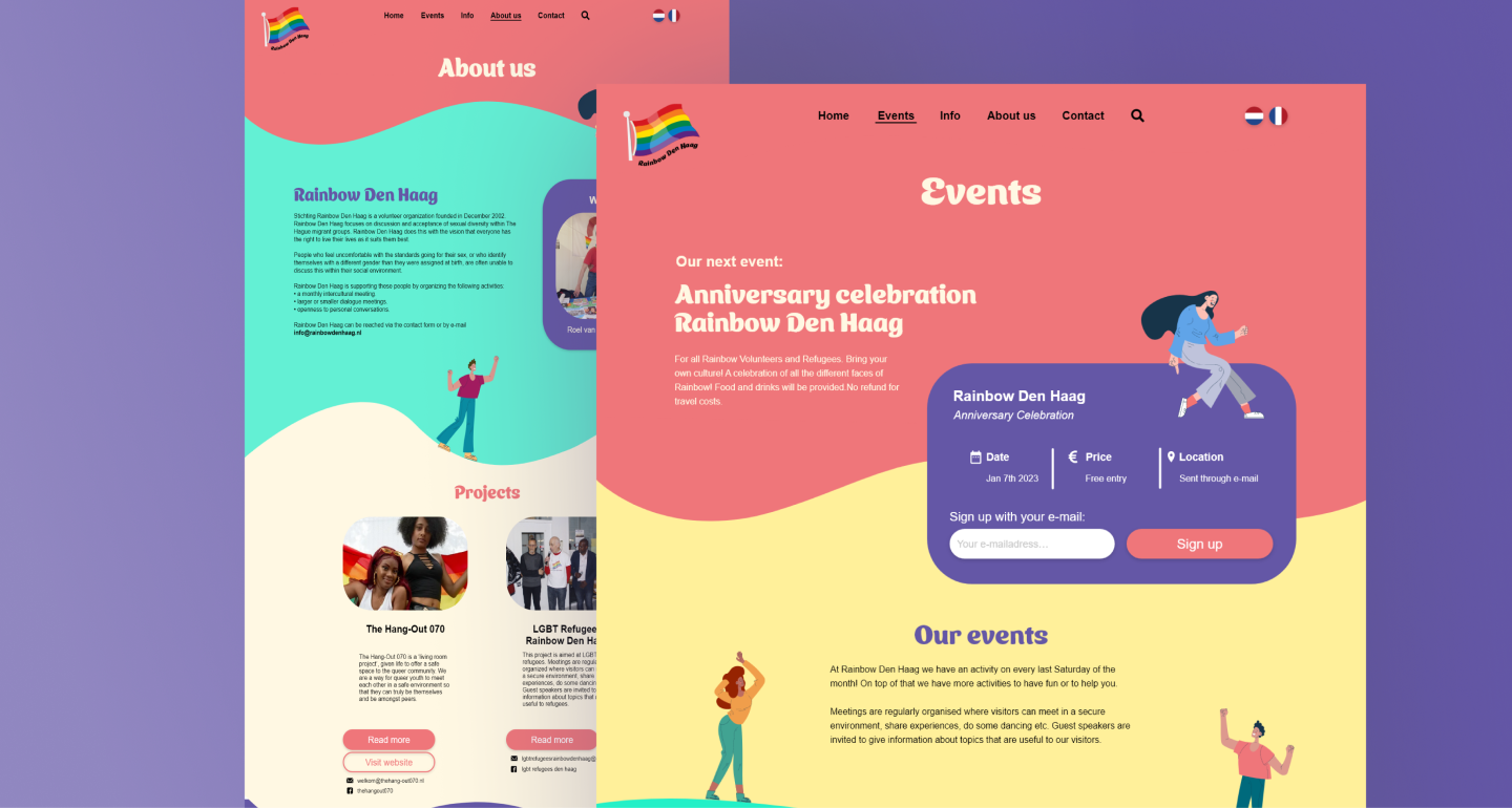
-LGBTQ+ refugees want information around new hangouts (meetings) to be communicated more clearly.
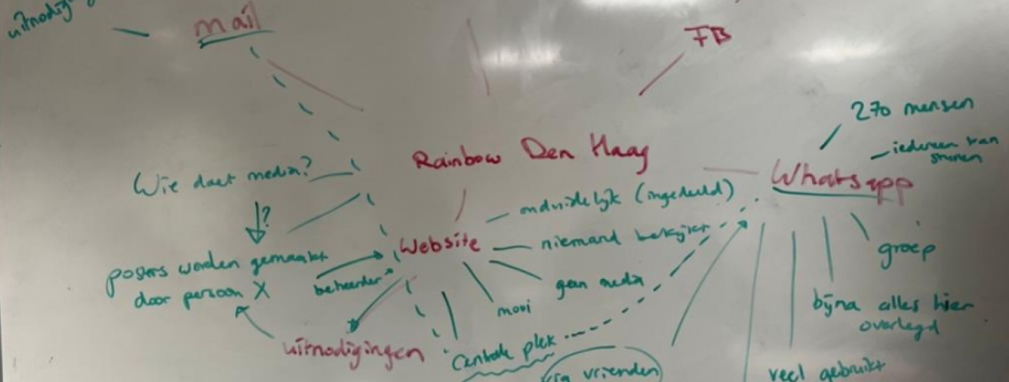
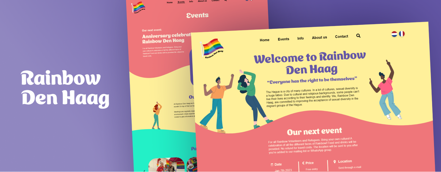
-The website does not reflect the feeling of the hangouts properly: it feels like family and it’s very cozy, but the website is plain.
-LGBTQ+ refugees want to stay informed on what to do during their procedure.
Define
User needs
An important technique we used during the research phase was identifying user needs. This helped us gain a deeper understanding of our target audience and their specific challenges. Because we were designing for LGBTQ+ refugees, it was essential that the design centered around their needs and experiences.
Synthesis wall
To review all the information we gathered, we created a synthesis wall. On this wall, we organized all the data we had collected and translated it into insights, comments, learning outcomes, and key terms. We then grouped these elements and added the user needs.
ideate
Mindmapping
After creating the synthesis wall, we continued brainstorming through mind mapping. In this process, we explored various important elements, such as the key functions the website should have and the wishes of the client. This created a foundation for the lotus blossom and allowed us to see which elements we could explore.
Lotus blossom technique
Based on the outcomes of the mind map, we gained insight into the current problems that LGBTQ+ refugees are having with the website. For each problem, we wrote potential solutions around it. This technique provided us with many ways we could use to improve the website.
protoype
Sketches
Based on the outcomes of the lotus blossom exercise, we sketched ideas for the Rainbow Den Haag website and developed three concept directions. Each concept focuses on a different user need:

Show me the way: A website centered on providing clear, accessible information for LGBTQ+ refugees. This includes guidance on procedures, FAQs, and an overview of supportive spaces and resources in the Netherlands.

Let’s get together: A concept focused on RDH’s community events. The website highlights upcoming Rainbow Den Haag hangouts, including details on who can join for example, women-only hangouts or mixed groups.

Feels like family: Primarily focused on creating a website where users feel free to express their authentic selves, this concept centers on acceptance and creating a genuine sense of safety and belonging.
Wireframes
To ensure that our concept fits the needs of both users and the company, we validated the concepts with the client. The client ended up choosing for the concept let’s get together to ensure that users know when Rainbow Den Haag’s events will take place. Based on this decision, we moved on to creating the website’s wireframes. Because the concept centers on RDH’s community events, we made sure the upcoming event is prominently highlighted as the main focus.
test
Hi-fi prototype
After wireframing we created the high-fidelity prototype in which we added the colors, fonts and images. The website had to evoke a warm and welcoming feeling, which is why we chose for a bright color palette with playful fonts.
Persona-based walkthrough
To validate the design we wanted to test the website with actual users, but due to time pressure we were unable to. Instead we decided to conduct a persona-based walkthrough, in which we went through the design as the persona displayed below. This provided us with design improvements which we later implemented into the design.
Final product
< View CleanlingsView feature improvement >