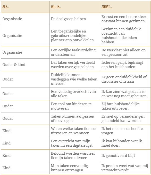
User interviews
For this research, I created separate interview questions for both target groups: children and parents. These interviews were designed to help me understand their needs and answer the main research questions. The interviews have provided me with information which I have converted into key insights. These are the main takeaways:
-Household tasks are often unevenly divided, with unclear agreements and little contribution to shared tasks from children.
-Families value a fair, rotating task distribution based on time and use.
-Hard to motivate: rewards help, but parents struggle to keep children engaged.
-Verbal instructions work for small tasks, but a digital planning tool is preferred for multiple tasks.
-The ideal situation is a fair division, clear overview of tasks, and family members taking initiative without reminders.
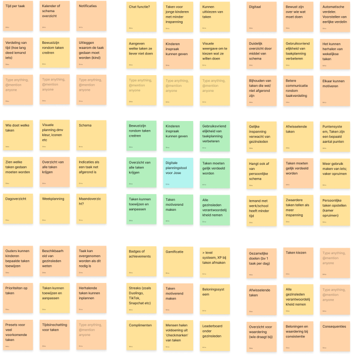
Mindmapping
After concluding the research, I started brainstorming. For this, I chose mind mapping as a method to visualize a brief overview of the current problems. The mind map gives me insight into the problems the target group is experiencing currently and allows me to think in a solution-oriented way. To explore this further, I used the Lotus Blossom technique as a second and more in-depth method.
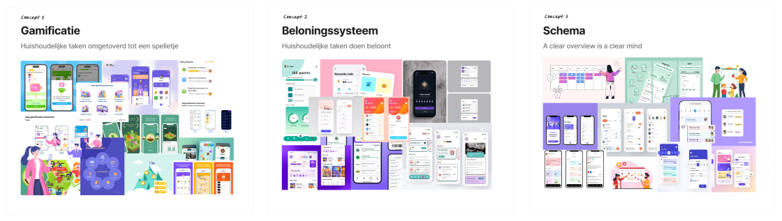
Concepts & validation
To begin the conceptualization process, I organized the outcomes of the Lotus blossom into three groups. I then transformed these three groups into concepts, each with a specific focus: gamification, reward system, and a schematic task overview. To ensure these concepts were clearly communicated to the client, I created mood boards and a wireframe for each concept.
To ensure the concept best fits the company, I validated the concepts with the client. The client preferred the gamification concept but mentioned that the reward system is a good solution to motivating children. She indicated that she would like me to combine these concepts so that the result aligns with her vision.
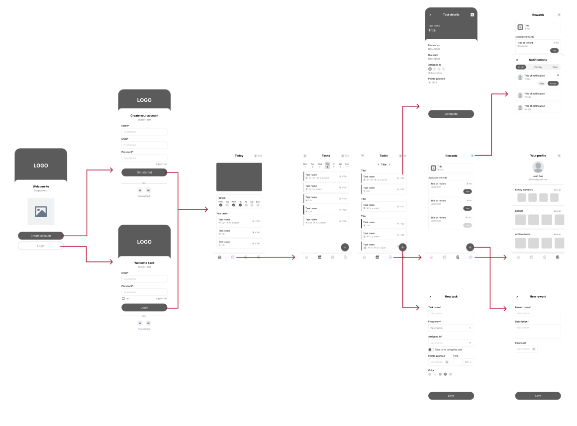
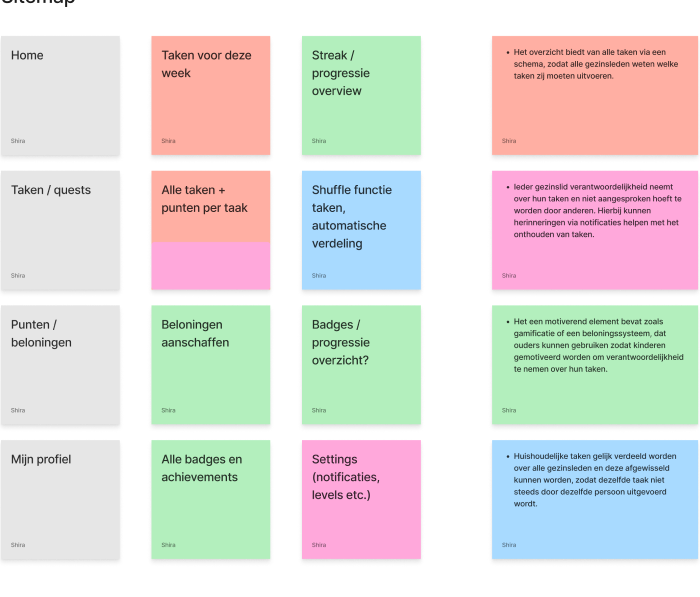
Sitemap
To gain a better understanding of how the app will be structured, I created a sitemap. The sitemap provides an overview of the app’s navigation and all the screens that need wireframes. It also gives me insight into the different types of features I want to implement. The structure of the sitemap is based on the design criteria from the final conclusion of the research report, ensuring that the app meets the most important requirements.
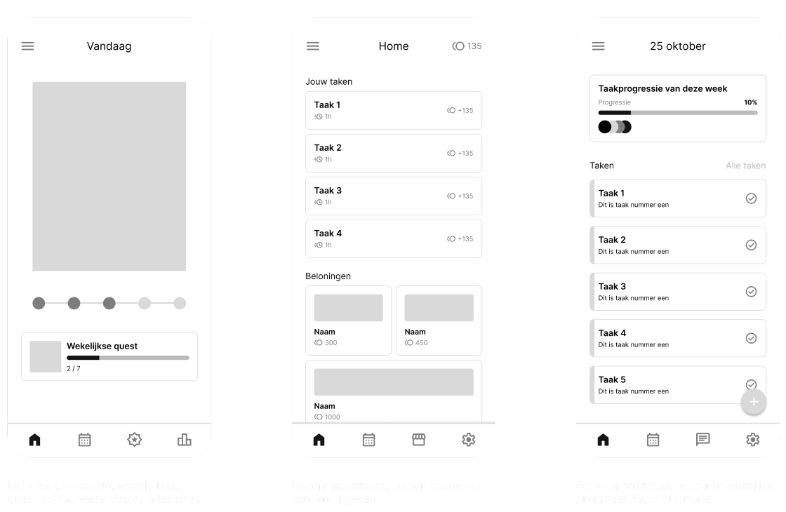
Wireframes
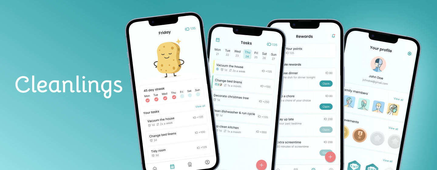
After creating a sitemap, I began wireframing. Based on the sitemap, I started designing the main screens: the homepage, task overview, rewards, and profile.
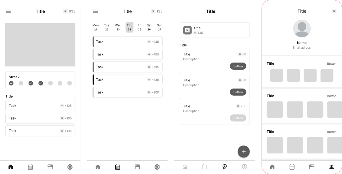
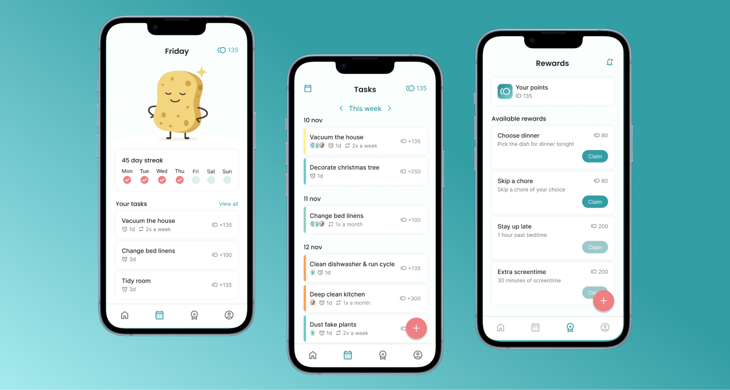
Implementing gamification and reward system
Research and interviews revealed that children are motivated by rewards and gamification, while parents often struggle to motivate them. To solve this, I integrated both gamification and a reward system. Gamification includes streaks, badges, and achievements, while the reward system allows tasks to be completed in exchange for points that can be redeemed for rewards. These elements are linked to the home and rewards screens, enforcing both engagement and motivation.
Streak character
To make the streak more engaging, I created a character to visually represent the streak. Characters can foster an emotional connection, making children more invested in completing tasks to keep the streak going. The streak character is displayed on the home screen, providing a motivating, visual way to track progress and encouraging repeated app use.
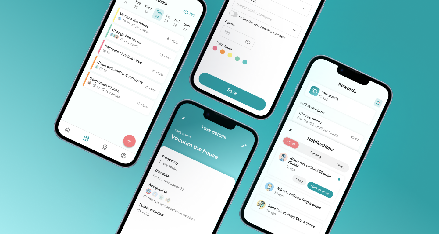
Task overview & distribution
Families expressed a need for clarity in task distribution and responsibility. The app provides a weekly task overview, showing who is responsible for each task, deadlines, and repetitions. Profile photos, icons, and color coded labels help users understand their responsibilities.
Visual design
The visual design aimed to create a calm, organized interface. A palette of blue, white, and coral pink was chosen based on color psychology: blue conveys calm, productivity, and order, while coral pink provides contrast. Colors were applied consistently using the 60-30-10 rule, contributing to a clean interface.