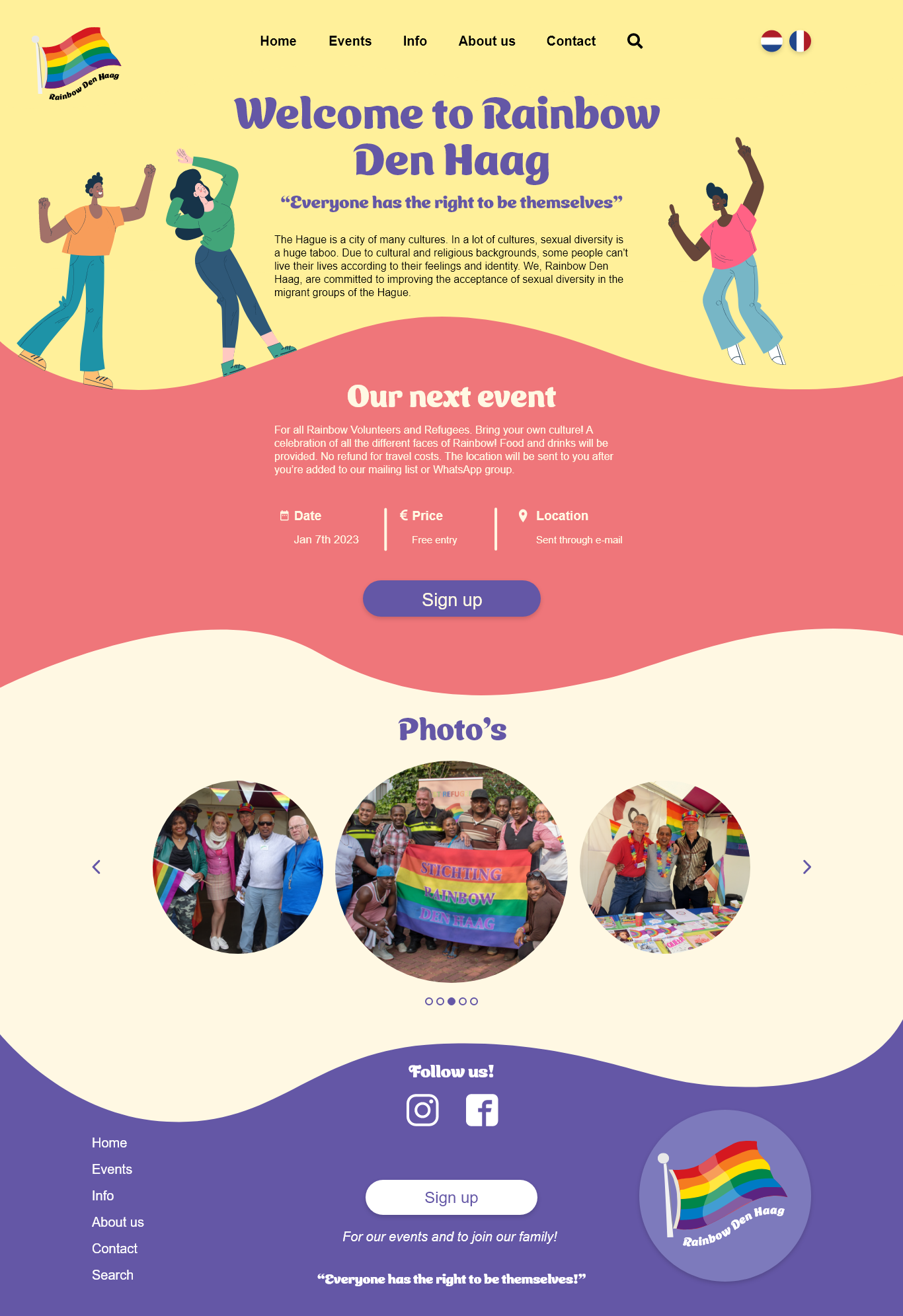
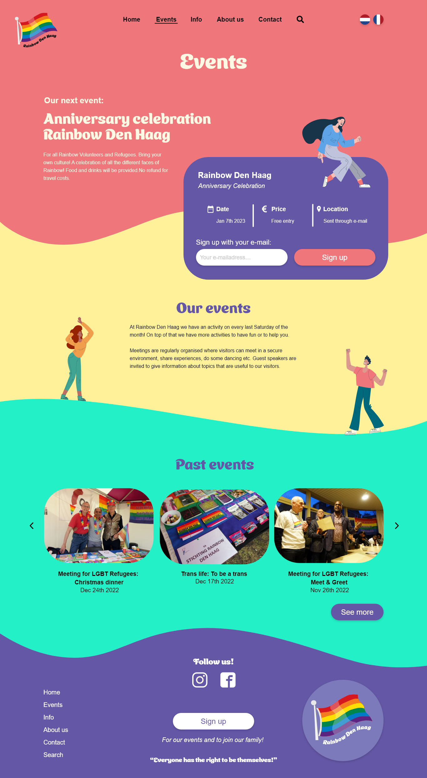
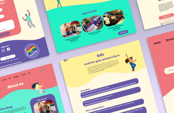
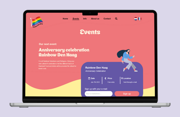
For this project, we were tasked with improving the website of Rainbow Den Haag. Considering that the target audience is LGBTQ+ refugees, we conducted thorough research to understand their needs. This project gave me insight into designing for a vulnerable group.


The problem I tackled during this project was creating a website for Rainbow Den Haag, a company that focuses on creating a safe space for LGBTQ+ refugees. They organize monthly outings in a cozy space, where people can come together to celebrate being themselves. My team noticed that their website was very plain and serious, which might be intimidating when looking for a safe space. As a refugee you would want to feel welcomed and invited to a LGBTQ+ space, since joining an outing like that is already hard as is. That is why we made it our mission to create a welcoming website for the LGBTQ+ refugees.
In order to improve the website we needed to research the target audience. We visited one of the "hangouts" that Rainbow Den Haag hosted to speak to our target audience. To properly understand what was necessary to improve the website, we interviewed LGBTQ+ refugees to find out what they would want to see on the website. We also provided them with an online form, so they could answer these questions in their own time. After collecting all answers we were able to translate our findings into user needs. The user needs were going to be the main focus of the design, since we wanted to create a website which speaks to them.


To provide a clearer understanding of our ideas, we created wireframes based on the mood boards for three of our concepts. Each concept has its own primary focus: one centered around informing users about the company and events, another offering an educational page for questions and information, and the last one dedicated to informing users about new LGBTQ+ events.
Once the company selected the desired concept, we started designing. First, we created a style guide to ensure structure and consistency throughout the website. Our goal was to make the website warm and welcoming. We achieved this by utilizing a playful font and bright colors. To respect the LGBTQ+ refugees and not violate their privacy, we chose to use illustrations of people instead of photographs. Given the vulnerability of this target group, we had to apply special measures. Upon completing the design, we converted it into a prototype using Adobe XD, enabling us to test the website ourselves.


To ensure that our website was functional and met user needs, we decided to test the prototype. Unfortunately, the target group was unavailable for the final testing. As a workaround, we conducted a persona-based walkthrough of the prototype. This method still provided us with valuable insights and allowed us to make final improvements to the website.